Maintaining high image quality is essential in the realm of responsive web design, where websites are accessed across various devices with differing screen sizes and resolutions.
The challenge lies in ensuring that images look sharp and detailed on high-resolution displays while not compromising the loading time or performance on devices with lower resolutions. This balance is crucial for providing an optimal user experience, as image quality and website performance significantly impact user satisfaction and engagement.
This tutorial will talk about achieving image optimization while preserving the quality of your images.
Quality Versus Performance
High-quality images, while aesthetically pleasing, come with a significant drawback—larger file sizes. These larger files take longer to download, especially on slower internet connections or mobile devices. This increased load time can lead to several issues, including:
- Increased Bounce Rates: Users are likely to leave a site that takes too long to load.
- Lower Search Engine Rankings: Search engines, like Google, prioritize fast-loading websites in their rankings.
- Poor User Experience: Slow load times can frustrate users, negatively affecting their experience and perception of your site.
Consequently, while it's tempting to use the highest quality images available to make websites look attractive, this approach can backfire by adversely affecting site performance and user satisfaction.
Nearly 50% of a typical page’s weight is made up of images, which is why it's just as important to optimize images being served as it is to preserve the image quality.
We recommend serving the right sized image for the right device to optimize images on the web. Serving correctly-sized images is important because it minimizes bytes transferred and CPU overhead. The srcset attribute is one of the best ways to do so today.
Before we talk about srcsets, we're going to talk about what Device Pixel Ratio (DPR) is and how it affects your image quality.
Device Pixel Ratio
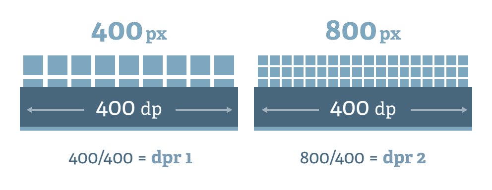
Device Pixel Ratio (DPR) is a way to unit to measure how clear or sharp a screen can show pictures and text. It's about comparing two types of pixels: the tiny dots you can see on a screen (physical pixels) and the ones that web designers use when they're creating websites (logical pixels). Different devices, like phones, tablets, and computers, have different DPRs because some screens can pack more dots into the same space, making images look sharper and more detailed.
Device pixel ratio is displayed as a multiplication of 1 pixel. For example, a device with a DPR value of 2.5 means that the pixels on a screen are 2.5x more dense (2.5x DPR). You can see what your device's pixel ratio is by visiting this page. Depending on your device, it will be anywhere from 1 to 5.
When an image element is placed on a website, it takes up logical pixels on the page. You can use CSS to scale images to fit within defined logical pixels. For example, you can place a 1000px width image into a 500px width rendered container, or a 1000px width container.
You would think that for 500px width image container on a website you would need an image 500px wide. Due to the varying resolutions of devices today, it's required to use a higher resolution than the image container in order to maintain image quality on the web. You can experiment with this by seeing this demo:
Open this example in a new window
In the demo above, the image container is 500px wide. By default the image loads at 500px width, which creates a low quality image if you're using a modern device (most laptops have a DPR greater than 1x). By toggling to the next resolution (1000px width) resolution, you will notice a large different in quality.
When viewing a website, your device multiplies the number of defined logical pixels by your device's DPR to display the image. If the image container above is 500px wide and your DPR is 2.0, then you require an image that is 1000px wide in order to preserve the image quality - no more no less.
Devices all have variable DPR values. To create responsive images that match your device pixel ratio, we will use srcset.
Using srcsets with DPR
srcset (also known as source set) allows web developers to specify a list of image sources for the browser to choose from, based on the user's DPR. Here is a simple example of an srcset used in an <img> tag using a "1x, 2x, 3x" pattern:
<img
  srcset="asset.png 1x, asset-2x.png 2x, asset-3x.png 3x"
  src="asset.png"
>
This tells the browser to select a different file depending on the user's device pixel ratio. Traditionally, this is accomplished by storing several different versions of a file online, and specifying a different file for each DPR. This can be difficult to maintain, as it requires storing and maintaining a large variation of asset sizes in order to implement an srcset.
With the Rendering API, we can instead dynamically create any number of image variations to be used in srcsets.
Using the imgix w and dpr URL parameters, we simplify the amount of effort it takes to generate the srcset attributes on our images. Instead of storing multiple versions of the same file, we create different resolutions from one single file. See this in action below:
<img
  srcset="https://assets.imgix.net/examples/bluehat.jpg?w=400&dpr=1 1x,
          https://assets.imgix.net/examples/bluehat.jpg?w=400&dpr=2 2x,
          https://assets.imgix.net/examples/bluehat.jpg?w=400&dpr=3 3x"
  src="https://assets.imgix.net/examples/bluehat.jpg?w=400"
>This gets us an image that serves out the best resolution for each device, based on its device-pixel-ratio (DPR). The DPR parameter multiplies the w of the image. If the DPR of a device is 3, the output image will be 800px, which is exactly the amount of pixels needed to display a crisp image. No more, no less.
This gives you the best of both worlds: full resolution for devices that support it, without delivering more data than necessary to devices that won’t use it. By using imgix, we only have to store the original asset and then manipulate it on the fly as we've seen above. This also removes the headache if and when a 4x device comes out. imgix currently supports up to dpr=5.
This practice works best with fixed image layouts, or image layouts where the rendered size of an image element is not expected to change. Using srcset with dpr is currently widely supported. If you choose to use the "1x, 2x, 3x" pattern for srcsets, we highly recommend using variable quality to modify the quality of the image as the resolution increases.
Using Variable Quality
When setting dpr with imgix, you may want to consider adjusting the quality of your images. Setting the q parameter to lower values for higher DPRs allows you to reduce the file size while maintaining a denser pixel set for your image.


This common practice is made easier with the Rendering API. Adjusting the quality works especially well with lossy formats such as WebP and JPEG.
Using srcset and sizes with Media Queries
A different approach to handling responsive images for fluid layouts is to use size definitions with srcset. This solution gives you the ability to target sizes based off of media query definitions within a sizes attribute. This is best for flexible image rendering, where the size of an image can change depending on the browser size. The browser will request the most appropriate image or—depending on the browser—will load the best image from the cache when available.
The following example demonstrates sizing three images with imgix at 1024, 640, and 480 pixels wide. Using the sizes attribute, we are targeting two queries for behavior for the images.
At a viewport of 36em or above, the images will display at 1/3 the viewport width. Below that size, the images will display at the full size of the viewport. At those sizes, the browser will determine which image to load in when the page is rendering for the given target size.
<img
  sizes="(min-width: 36em) 33.3vw, 100vw"
  srcset="
    https://assets.imgix.net/unsplash/bridge.jpg?w=100&h=100&fit=crop    100w,
    https://assets.imgix.net/unsplash/bridge.jpg?w=116&h=116&fit=crop    116w,
    https://assets.imgix.net/unsplash/bridge.jpg?w=134&h=134&fit=crop    134w,
    https://assets.imgix.net/unsplash/bridge.jpg?w=156&h=156&fit=crop    156w,
    https://assets.imgix.net/unsplash/bridge.jpg?w=182&h=182&fit=crop    182w,
    https://assets.imgix.net/unsplash/bridge.jpg?w=210&h=210&fit=crop    210w,
    https://assets.imgix.net/unsplash/bridge.jpg?w=244&h=244&fit=crop    244w,
    https://assets.imgix.net/unsplash/bridge.jpg?w=282&h=282&fit=crop    282w,
    https://assets.imgix.net/unsplash/bridge.jpg?w=328&h=328&fit=crop    328w,
    https://assets.imgix.net/unsplash/bridge.jpg?w=380&h=380&fit=crop    380w,
    https://assets.imgix.net/unsplash/bridge.jpg?w=442&h=442&fit=crop    442w,
    https://assets.imgix.net/unsplash/bridge.jpg?w=512&h=512&fit=crop    512w,
    https://assets.imgix.net/unsplash/bridge.jpg?w=594&h=594&fit=crop    594w,
    https://assets.imgix.net/unsplash/bridge.jpg?w=688&h=688&fit=crop    688w,
    https://assets.imgix.net/unsplash/bridge.jpg?w=798&h=798&fit=crop    798w,
    https://assets.imgix.net/unsplash/bridge.jpg?w=926&h=926&fit=crop    926w,
    https://assets.imgix.net/unsplash/bridge.jpg?w=1074&h=1074&fit=crop 1074w,
    https://assets.imgix.net/unsplash/bridge.jpg?w=1246&h=1246&fit=crop 1246w,
    https://assets.imgix.net/unsplash/bridge.jpg?w=1446&h=1446&fit=crop 1446w,
    https://assets.imgix.net/unsplash/bridge.jpg?w=1678&h=1678&fit=crop 1678w,
    https://assets.imgix.net/unsplash/bridge.jpg?w=1946&h=1946&fit=crop 1946w,
    https://assets.imgix.net/unsplash/bridge.jpg?w=2258&h=2258&fit=crop 2258w,
    https://assets.imgix.net/unsplash/bridge.jpg?w=2618&h=2618&fit=crop 2618w,
    https://assets.imgix.net/unsplash/bridge.jpg?w=3038&h=3038&fit=crop 3038w,
    https://assets.imgix.net/unsplash/bridge.jpg?w=3524&h=3524&fit=crop 3524w,
    https://assets.imgix.net/unsplash/bridge.jpg?w=4088&h=4088&fit=crop 4088w,
    https://assets.imgix.net/unsplash/bridge.jpg?w=4742&h=4742&fit=crop 4742w,
    https://assets.imgix.net/unsplash/bridge.jpg?w=5500&h=5500&fit=crop 5500w,
    https://assets.imgix.net/unsplash/bridge.jpg?w=6380&h=6380&fit=crop 6380w,
    https://assets.imgix.net/unsplash/bridge.jpg?w=7400&h=7400&fit=crop 7400w
  "
  src="https://assets.imgix.net/unsplash/bridge.jpg?w=640&h=640&fit=crop"
/>
While the list of images to generate may look intimidating, many of the imgix libraries can automatically generate an optimal srcset for you. This allows you to create an optimal srcset with only 1 line of code. See the CodePen below.
When using srcset with sizes, it's best to use at least 12 different image sizes. This allows the browser to make the most accurate choice when deciding which image to show to the user.
<img ix-src="https://assets.imgix.net/unsplash/bridge.jpg?w=640&h=640&fit=crop" sizes="(min-width: 36em) 33.3vw, 100vw"/>It is very important to specify the correct sizes attribute, otherwise the browser will select select an image that fits 100% of the webpage by default. The sizes attribute should be set to the size of the expected rendered width in pixels, and can use media queries to target elements with variable render width.
Best Practices Using srcset with imgix
There is more to think about when delivering the best images possible with srcset and imgix. imgix affords the ability to add additional operations to give you more control over your output images, and because they are defined in the URL, you can fine-tune your settings and make late-stage edits as decisions change.
Use an Optimal Number of Variations
One of the challenges of using srcset is that you want to generate enough sizes so that most of your users are downloading images that are close in size to what they are seeing on the screen, but if you generate too many sizes you can end up impacting cacheability which could have a negative performance impact.
For srcsets using the "1x, 2x, 3x" pattern, we recommend using up to 5x DPR to cover all different device types.
For srcsets using the sizes attribute, we recommend using one of our libraries to generate the srcset. Note that it is necessary to specify an appropriate sizes attribute to prevent the largest image from being used.
Providing a large number of images to the browser increases the DOM size, which is an error that sometimes shows in Google Pagespeed. As long as you are offerring less than 24 image variations per image element, you can ignore the Pagespeed warning. The browser only uses one image from the set. Additionally, the performance loss from increased DOM size is offset by accurate image output from the browser.
Use fit=max
Using the fit=max parameter on an imgix URL will ensure that an image is never delivered larger than its original size. This way, when requesting a dpr=3 image, there won’t be any image extrapolation. Read more about fit in the documentation.
Use auto=compress,format&cs=srgb
The parameter combination auto=compress,format&cs=srgb will deliver compressed AVIF images for browsers that support it (Chrome, Firefox, etc.) and fall back to the original format for other instances. More modern formats like AVIF can greatly cut down the amount of image data sent to the client, sometimes by as much as 35%.
Since srcsets retain the perceived quality of an image, it's safe to use auto=compress to further optimize your asset. We recommend also adding cs=srgb to prevent changes in color during compression.
Read more about Automatic Content Negotiation in the documentation.
What srcset to use
We talked about the two different methods of creating srcsets:
Both of these can be applied to any site to optimize their image usage. Using srcset with the sizes attribute is recommended as a best practice since the browser will use the most optimal image when an the appropriate srcset and sizes values are provided.
Otherwise, using an srcset with the 1x, 2x, 3x pattern is easier to implement, and may offer better caching performance due to using a smaller set of images. When using this pattern, make sure to also use variable quality to further optimize the performance of your site.
Summary and Related Tutorials
Responsive imagery is a rapidly-changing area of implementation, and different methods are applicable to different use cases. Here are our other tutorials that touch on aspects of responsive design.