How to Build a Responsive Image Gallery in React
If you are a frontend developer, you likely work with apps and websites that need an image gallery. From photo-sharing applications to messengers and note-taking apps to search engines, an image gallery is the best way to show the previews of multiple images on a webpage and let users interact with those pictures.
While building a simple image gallery can be straightforward, it’s not easy to create resized copies of all images for all available screen sizes from a desktop to a smartphone. The task becomes more difficult if you need to optimize image bandwidth and reduce the page load time. Scaling an image gallery to hundreds or thousands of pictures with all of these constraints in place is even more challenging.
What if there was a way to quickly build responsive image galleries without the necessity of creating multiple images for every possible screen size?
That is one of the use cases we had in mind when building Imgix. With the Imgix service positioned between the end user and where the image is stored (for example, an S3 bucket), we can dynamically process the original images from your origin to resize, filter, change formats, and ultimately cache the results. We provide many client libraries and CMS plugins to make the integration with Imgix even more convenient.
In this article, we’ll focus on the react-imgix library that is especially useful for React developers. Why? It utilizes the HTML image srcset attribute, which grants a browser the flexibility to choose the best-suited image for the current window size. Since react-Imgix automatically constructs a robust srcset out of the box, you can spend less time worrying about building responsive images yourself.
Because Imgix can serve images at different sizes on the fly, it meshes really well with srcset. The image derivative selected by the browser will be requested/retrieved/cached by our service. This means not having to worry about resizing/saving a different version of each image manually. Another reason users will find react-Imgix valuable is that the srcset is constructed in a way to balance maximizing image size/quality while minimizing bandwidth costs.
Imgix in action
Now that we have some context about the platform, let’s jump in to how you can utilize it to build a React image gallery. Here’s the CodeSandbox with the code for the project so you can follow along. In this section, we’ll cover the following steps:
- Writing a
package.jsonconfig file that contains all dependencies - Implementing simple HTML and CSS files
- Setting up a few JavaScript files that contain all the React logic and Imgix magic
Creating the package.json file
The general setup is pretty straightforward as long as you’re familiar with React — since this is a JavaScript project, you’ll need a package.json. In the boilerplate code, you’ll find the following dependencies:
"dependencies": {
  "@types/node": "^12.7.8",
  "prop-types": ">=15.5.6",
  "react": "^16.12.0",
  "react-dom": "^16.12.0",
  "react-imgix": "^9.0.1",
  "typescript": "^3.6.3"
}
Of course, we’ll need the typical React libraries, but you’ll notice the react-imgix library as well. react-imgix gives us the tools we need to create a simple photo gallery with Imgix, so make sure you install this one.
The HTML and CSS files
For the purposes of this simple Imgix demo, the boilerplate for both of these files is really simple. In the HTML file we have a div with an id that serves as the connection to our root JavaScript file:
<div id="root"></div>That’s it!
Our CSS file contains a bit more — mostly styling for classes we use in the React components, but we still keep the code on the cleaner side. For example, here’s the CSS for the gallery class used in — you guessed it — our gallery component:
.gallery {
  display: grid;
  overflow: hidden;
  grid-template-columns: repeat(auto-fill, minmax(20rem, 1fr));
}
We want the gallery to be displayed as a grid of elements, and the display: grid property will help us achieve exactly that. In the grid layout, the images might have dimensions larger than their tile in the gallery, and we add the overflow: hidden property to make sure the images don’t overlap with each other.
The last two properties specify the size of each gallery item. The repeat(auto-fill…) part indicates that we want all columns in the grid to have the same size with the minimum of 20 em units and the maximum of the size of a column of the grid. If you are curious about how these CSS options work under the hood, you can learn more in this Auto-Sizing Columns in CSS Grid article.
The JavaScript logic
Now to the heart of the project! In the index.js file, you’ll see we import our child components (among other imports) and create our App component.
class App extends Component {
  constructor() {
    super()
    this.state = {
      name: "React",
    }
  }

  render() {
    return (
      <div>
        <HeroImage />
        <Gallery />
      </div>
    )
  }
}
The App component renders both of its child components, one right after the other. We render this main component in the last line of the file, connecting it to our HTML file:
render(<App />, document.getElementById("root"))You’ll notice that nowhere in this index.js do we use Imgix. That’s because we save it for both of our child components, so now let’s look at those. First, the Gallery component. After importing our libraries, we create an array of strings containing the file names of all our images:
const images = [
  "forest1",
  "forest2",
  "forest3",
  "mountain1",
  "mountain2",
  "mountain3",
  "river1",
  "river2",
  "river3",
]

const buildURL = (imagePath) =>
  `https://assets.imgix.net/tutorials/${imagePath}.webp`
With these set up, we now construct the gallery:
export const Gallery = () => (
  <div className="gallery">
    {images.map((image) => (
      <Imgix
        sizes="(min-width: 960px) 33vw, (min-width: 640px) 50vw, 100vw"
        src={buildURL(image)}
        imgixParams={{
          fit: "crop",
          fm: "jpg",
        }}
        width={600}
        height={600}
      />
    ))}
  </div>
)
This code is creating a Gallery component that maps each image in the predefined array into an <Imgix/> element from the react-imgix library. This element uses srcset and sizes, allowing the browser to appropriately render the image immediately using the dimensions the user specifies.
The gallery offers many flexibilities, including allowing users to leverage other elements, such as the <img> and <picture> elements, providing ample room for creative direction.
Let’s look at the second child component. In HeroImage.js we have a component that renders images to the background using the Background mode:
export const HeroImage = () => (
  <Background
    src="https://assets.imgix.net/tutorials/forest4.webp"
    className="hero-image"
  >
    <h2>Imgix demo</h2>
  </Background>
)
This component is otherwise pretty simple — we just include the style for the component and a header — so let’s talk about background mode for a moment. The component mounts and measures the natural size of the container in the DOM, then renders an optimal image for those dimensions.
To avoid re-rendering the component, you can set a width and height manually by passing them as props, rendering a background image in one pass.
And there we have it! These two child components use different aspects of Imgix and demonstrate the ease and flexibility users can attain with the service.
The results
Let’s have a look at what the finished project looks like. You can view a live example of the project on CodeSandbox and make your own sandbox for editing.
Alternatively, you can download a copy of the project files by clicking File → Export to ZIP on CodeSandbox. After downloading the files, run yarn in the project directory to install all the dependencies. Then, use the yarn run start command to start the development server and open the browser with the project.
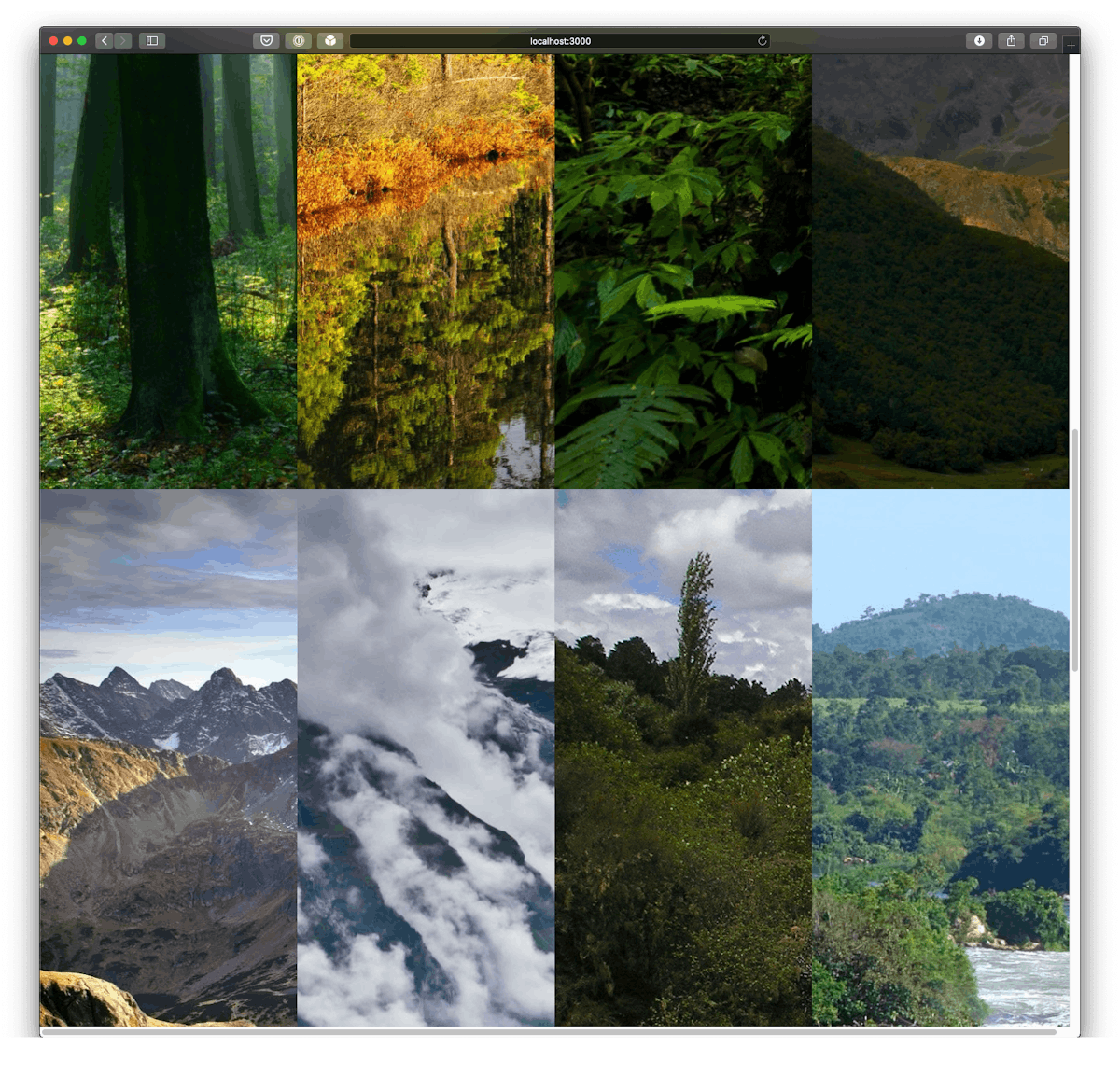
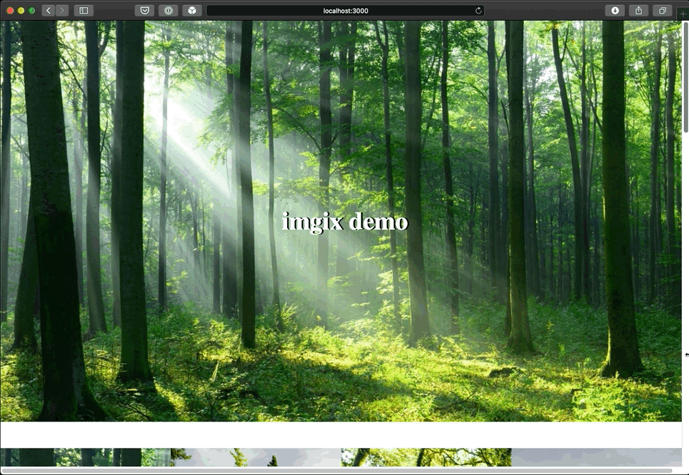
Once the project loads, you’ll be able to see the responsive hero image followed by the responsive image gallery.
The hero image will change its dimensions according to the size of the browser window. Try changing the window size to see how the hero image adapts:
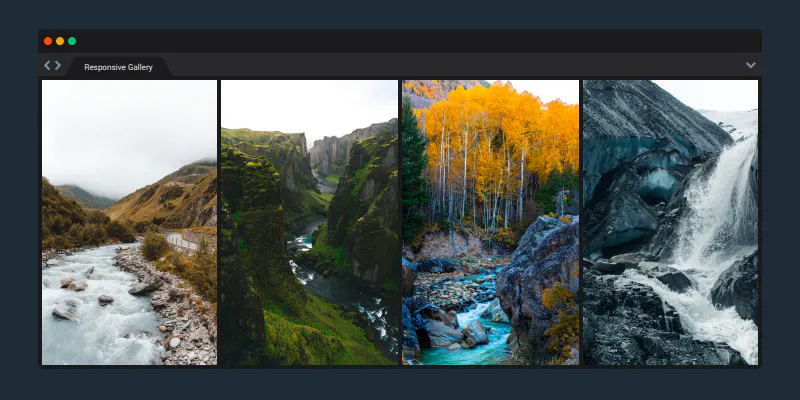
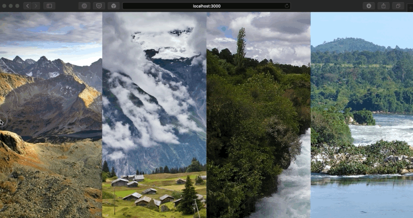
The image gallery will also change its appearance depending on how large the browser window is. Scroll down to the gallery section and experiment with different window sizes:
Summary
Using Imgix to create an image gallery is simple, reliable, and dynamic. It’s an ideal solution for those who work with a lot of images and want those images delivered in the appropriate format and size for all devices and browsers.
Other Resources
- React-Imgix library: Check out the official docs for the react-Imgix library
- Srcset and Sizes: Eric Portis discusses the history of responsive design and how the attributes that Imgix uses under the hood save bandwidth
- Responsive Images with srcset: Learn how to use srcset to support different device pixel ratios with Imgix