Focal Point Cropping for Responsive Art Direction

Until recently, responsive design has focused on the problem of resizing and optimizing images to serve smaller files to a wide variety of devices. With best practices for responsive design patterns solidifying for that case, it’s time to address the other less-implemented aspect of responsive design: art direction.
Resizing and cropping is only half of the equation for creating an engaging responsive image. Because detail and focus tend to get lost at smaller sizes and the desired aspect ratio isn’t the same across all devices, the focal point won’t always remain in-frame or legible just by shrinking the image. You need to art-direct the image to ensure that the focal point is the focus, especially for media and editorial sites where the image is the main draw into the content.
Imgix offers several ways to estimate a focal point automatically, but for true art direction, nothing beats controlling the center of the image and cropping for its dimensions and the container. This tutorial will show you how to use our focal point cropping parameters to get the strongest image for every device you need to support.
Finding the Heart of Your Image
Cropping for editorial generally requires multiple sizes and aspect ratios for each image, to support both multiple uses (hero unit, thumbnails) and responsive design requirements (square for mobile view, widescreen for desktop). Because all of these are coming from the same original, manually cropping and saving separate files is wasted effort.
Instead, with Imgix you can generate every version on demand to bring the most compelling and relevant parts of the image forward, and then plug those URLs into your responsive breakpoints. Let’s see how this works with a typical editorial-style photo. We’ll go step by step for each of the crops here—check out the related CodePen to see the underlying responsive HTML and how we’re using imgix.js to generate a complete srcset to support any size we might choose in the future.
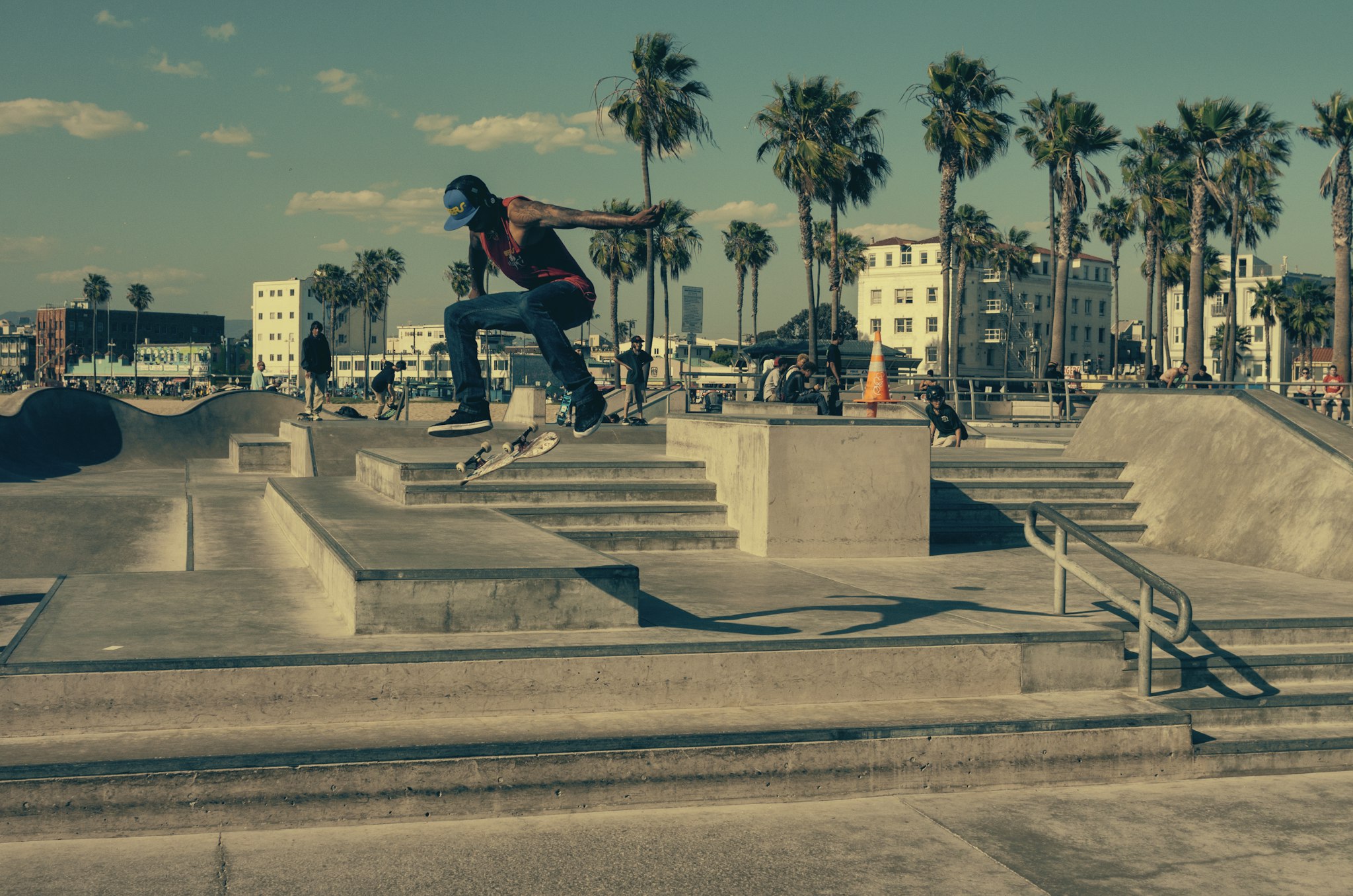
Here’s the original image at a hero unit width sized for a desktop (>1280 pixels wide), but without cropping:
w=2048- height is 1356 (scaled by the browser)
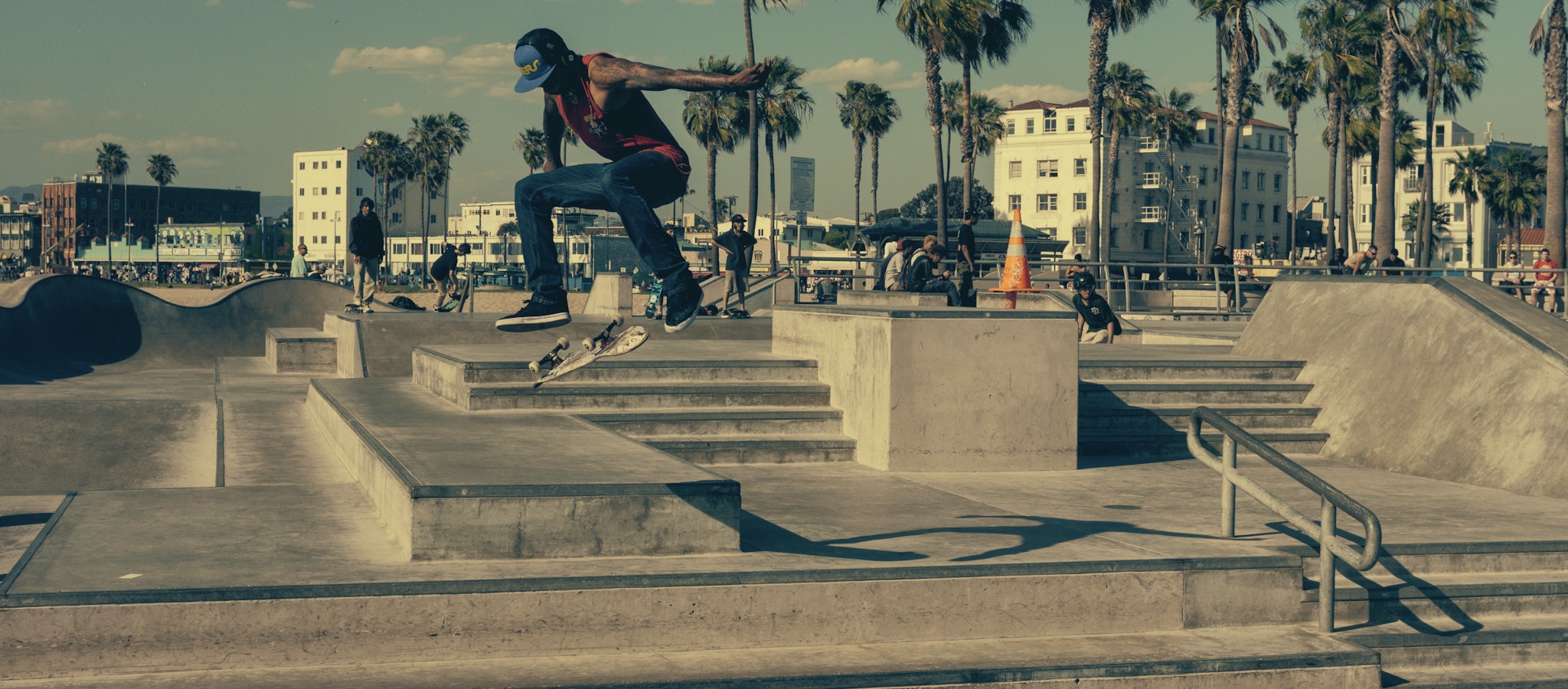
As a standalone photo, the composition has a lot of energy, but we need to crop to fit the container height and for several other sizes and aspect ratios without losing that dynamic quality. imgix’s focal point parameters (fp-x , fp-y , and fp-z ) will allow us to adjust the position of the skater. The default crop is from the center of the image, which gives us this:
This image is the right size for our container, but cropping from the center pushes the skater up to the top of the image. Using the focal point parameters, we can adjust his position vertically.
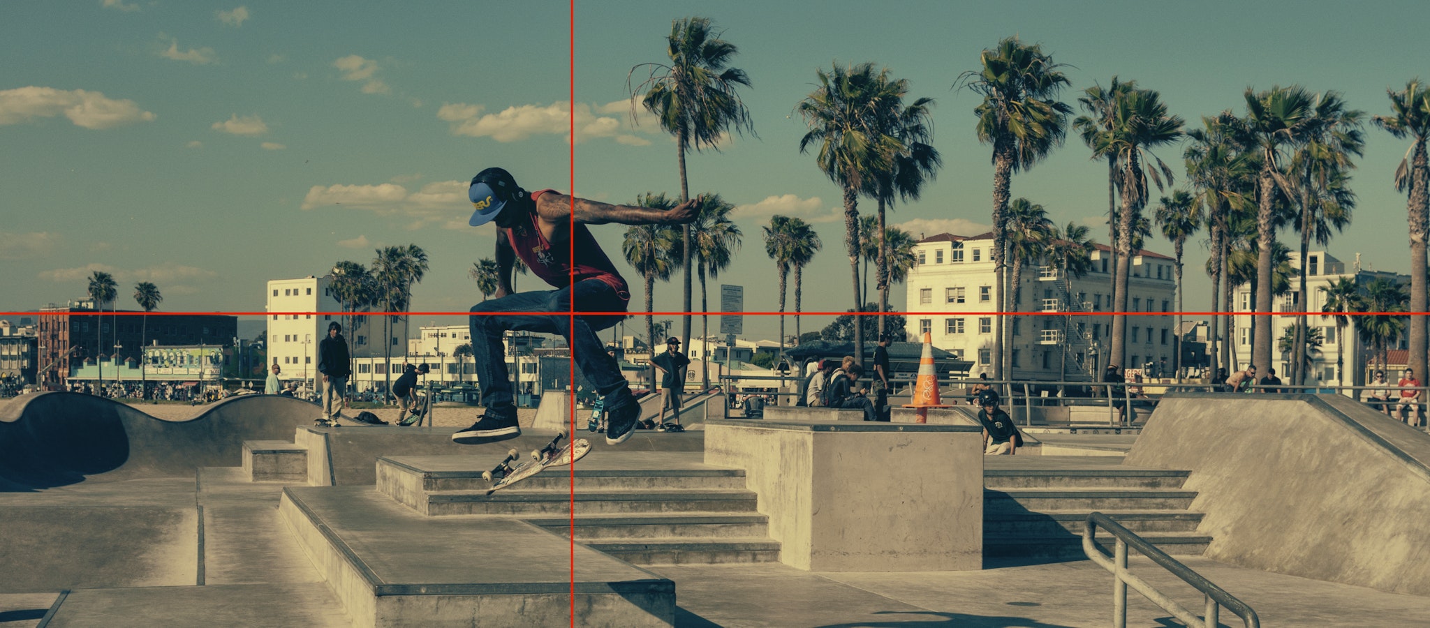
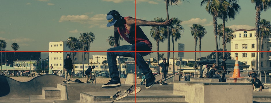
First we set the focal point, using the fp-debug parameter to show the coordinates and adjust until he is vertically at the center, ending up with values of fp-x=0.4 and fp-y=0.35 :
crop=focalpoint(chooses the focal point cropping mode)fp-x=0.4(moves the x coordinate to 40% of the total width, starting from the left edge)fp-y=0.35(moves the y coordinate to 35% of the total height, starting from the top edge)fp-debug=1(shows crosshairs indicating the chosen focal point—remove this parameter once the point is chosen)
This is all we need for the largest size; to keep the viewer’s focus at other sizes, we’ll need a way to get in closer.
Adjusting the Zoom
One of the reasons responsive art direction requires manual control is that changing sizes and aspect ratios also changes the image composition. To maintain visual interest, especially at smaller sizes, we need to zoom in on the focal point to make sure it’s as legible as possible.
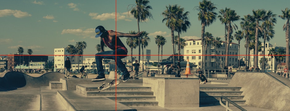
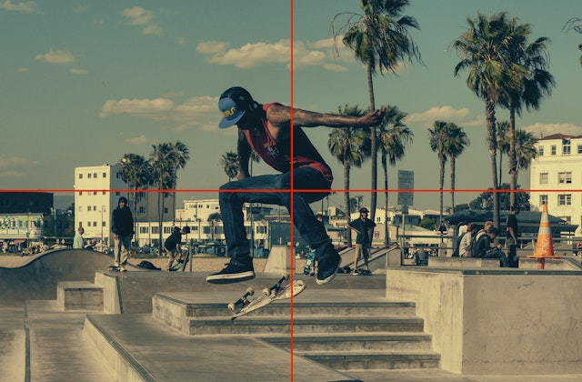
For a smaller desktop version (960-pixel breakpoint) this is what we would get with the same fp-x /fp-y coordinates—still good composition, but at the smaller size, the skater is starting to get a bit lost in the background:
To fix that, we can adjust the zoom (fp-z ) to get the viewer a little closer to the action and move the skater to the center:
w=940h=360fp-z=1.5(zooms in to the new center of the image at 150% of original size, then crops to specified dimensions)
Changing the Aspect Ratio
Now that we’ve centered the image on the skater and created the hero version of the image, we can easily go back and create the other sizes we need to serve based on the dimensions and responsive breakpoints defined in the design, one for tablets and one for phones. Because of the smaller screen width on these devices, we’ll be switching from a widescreen/hero aspect ratio to something a bit closer to square and zoom in a bit more, so that the skater remains front and center.
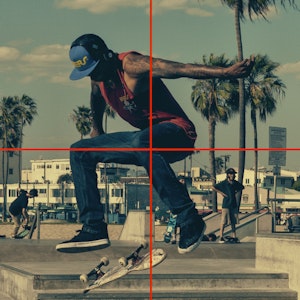
Similarly, for phones, we’ll crop and zoom in even more and go for a square image:
Now that we have the crops and sizes set up, we can plug these four versions of the image into a single <picture> element to always serve the correct version for the user’s device. We’re doing this with the imgix.js JavaScript library, so instead of using the Imgix parameters directly in the URL as in the above example, they’re passed to the JavaScript as values to build the URL. Here’s what that looks like for the 300×300 version:
<picture>
  <source
    sizes="calc(100vw - 40px)"
    ix-path="skateboarder.jpg"
    ix-params='{
          "w": 300,
          "h": 300,
          "fit": "crop",
          "crop": "focalpoint",
          "fp-x": ".4",
          "fp-y": ".35",
          "fp-z": "2.5"
       }'
  />
</picture>
To see how this pattern can be used across a library of images (and see the code behind this example), check out our focal point cropping CodePen. (Note: This demo doesn’t work well in Safari due to the way Safari implements srcset.)
Integrating Focal Point Cropping Into Your Workflow
How you can use focal point cropping will depend on your workflow for generating and storing images. Because it requires manual input to set the focal point, full automation for this level of art direction isn’t possible. However, building a tool to set and save the focal point of each image (or even a set of crop settings for a single image) by using the fp-debug parameter as a feedback mechanism is straightforward. If you’d like guidance about doing this, contact us.
Whether you’re integrating imgix’s focal point cropping into a workflow or using it manually, the true responsive art direction that it enables ensures that your readers get the most compelling image at every size, every time.
