Improving Site Performance
Using Imgix is a great way to improve your site or app’s performance by decreasing page weight without affecting the quality of your images. This guide covers in detail the many ways Imgix can make your site snappy.
Using imgix’s Content Delivery Network
By default, Imgix serves all of your images through a global content delivery network (CDN) to ensure that your images load as quickly as possible through one of our 96 POPs. No need to bring or configure your own CDN; your images will always be delivered as quickly as possible.
Reducing Image Data
Cameras and display capabilities are increasing all the time, which drives up the size of your images—even a sample smartphone camera image (with compression) weighs in at 1.4MB and 3264×2448 pixels. Variations in the image data and file format can increase the file size further. As a result, decreasing the amount of raw data contained in an image to just what is needed is the most straightforward way to reduce its file size.
From a raw pixel perspective, every 100x100 pixels you remove from an image is almost 40KB. Similarly, for images with large areas of the same color, reducing the color palette can give you solid size savings without an obvious difference in quality. By not fetching extraneous data, pages on your site or application will load and paint much faster. You can see a breakdown of potential savings in our Improving Image SEO guide.
Resizing Images
Resizing is the easiest way to remove unnecessary data from an image. Images are often served out much larger than needed for a page, which adds to the page weight considerably. By resizing your images with Imgix, you ensure that you deliver the exact amount of data required and not a pixel more, without having to create multiple versions for different devices or viewport sizes.
The most common method of resizing images on Imgix is with pixel-based sizes using the width (w) and height (h) parameters. Any image served through Imgix can be resized dynamically. Whenever a w or h parameter is set and has a value over 1, the image is resized to new pixel dimensions. For example, this original image is much too large for most applications.
Original (resized to 30% for display here)
w=0.3
- File Size: 1.99MB * Dimensions: 1942×2913 pixels
To resize this to something more usable, you only need to change w or h to a value that fits your application better.
Resized for Web — 600 pixels high
h=600
- File Size: 95kB * Dimensions: 400×600 pixels
Similarly, you can resize for a mobile browser or a thumbnail display and save even more.
Resized for Mobile — 200 pixels high
h=200
- File size: 15kB * Dimensions: 133×200 pixels
Pixel-based sizing works well with the fit and crop parameters when dealing with a known container size and image content at varying sizes, enabling you to center the most relevant part of the image in the container.
Imgix also supports percentage-based sizing using the w and h parameters. This method is especially useful when looking to scale down a large library of images by the same amount—for example, to 10% of the original images’ dimensions.
To resize the image based on a percentage, you set the w or h parameter to a value between 0 and 1. For example, setting a 1000-pixel image to w=0.5 will result in an image 500 pixels wide, with a corresponding 50% decrease in height.
Maintaining Aspect Ratios
If maintaining aspect ratios while resizing images is a concern, use the fit=clip parameter. By setting fit=clip, the image will always fit within the size specified by w and h while maintaining its aspect ratio. Let’s see this in action:
Original (resized to 15% for display here)
w=0.15
- File size: 7.0MB * Dimensions: 5615×2907 pixels
Now, we want to scale this image down to be at most 600×400, but maintaining the aspect ratio:
Resized to fit 600×400 container
w=600&h=400&fit=clip
- File size: 55kB * Dimensions: 600×311 pixels
The resulting image is 600×311 pixels. Notice that the exact aspect ratio of the original image is maintained. In cases like this where the requested dimensions don’t match the existing aspect ratio, the w parameter defines the max size, and the h parameter is adjusted from the requested size to the dimension that keeps the aspect ratio correct.
Cropping Images to the Container
Another way to reduce the amount of data in an image is to crop it to just the most meaningful part, so the extraneous content isn’t displayed. In effect, it allows you to zoom in on the image if the resolution of the original has enough data to allow it. This method also allows you to easily change the aspect ratio of an image to highlight one section.
For this example, let’s see how fit and crop values can affect an image. First, we’ll just resize the image in the above section to 800 pixels wide, which will fit well on a web page.
Resized to 800 pixels wide
w=800
- File size: 105kB * Dimensions: 800×414 pixels
Suppose we now want to focus the viewer on the part of the image where the person is, but in a vertically-oriented container. We can do this by changing the height parameter so it’s larger than the width, and setting fit=crop parameter to exclude the rest of the image.
Cropped to fit vertically-oriented container
w=250&h=414&fit=crop
- File size: 46kB * Dimensions: 250×414 pixels
Now we have a more visually striking image, with a 58% reduction in file size compared to the full image at the same height.
Supporting HiDPI Environments
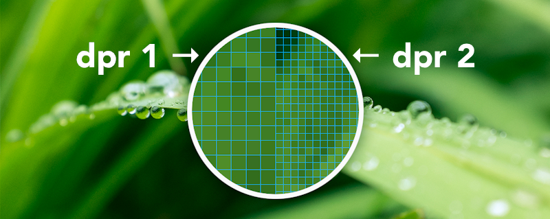
Supporting high-density screens can be difficult with a large media library. New pixel densities are constantly being introduced, and can require reprocessing of entire image libraries to ensure the best experience. imgix’s dpr parameter is an easier way to deliver the same image at different device-pixel ratios. This eliminates the need to scale down a larger image for lower-DPI environments or maintain a copy of the image in multiple sizes to support different screen densities.
Let’s see how this works in practice. We’ll start with a long-exposure night shot, sized to fit a web page on a standard monitor (dpr=1 by default, if unset).
Original (600×400 pixels)
w=600&h=400&fit=crop
Now let’s say we want to serve this image on an Apple Retina device, like an iPhone 6. The device-pixel ratio on these devices is 2: for every logical pixel, there are 2 pixels lengthwise and widthwise on the screen. To serve more pixels to these devices, we simply add the dpr=2 parameter. (This version will look sharper on a Retina display.)
dpr=2 (1200×800 pixels)
w=600&h=400&fit=crop&dpr=2
The resulting image is 1200×800, twice as large in each raw dimension. This easily drops into existing containers sized to 600×400 logical pixels.
Using the dpr parameter will also work with sub-pixel values, like 0.75 and 1.5. This is useful for dealing with other platforms like Android. The srcset attribute makes managing multiple pixel densities easy; in brief, you can manage all of the platforms listed above with one line of code:
<img
  srcset="
    https://assets.imgix.net/guide-site-perf-ocean.jpg?w=400       1x,
    https://assets.imgix.net/guide-site-perf-ocean.jpg?w=400&dpr=2 2x,
    https://assets.imgix.net/guide-site-perf-ocean.jpg?w=400&dpr=3 3x
  "
  src="https://assets.imgix.net/guide-site-perf-ocean.jpg?w=400"
/>
See our tutorial about using srcset with Imgix for more information.
Compressing Images
Once you’re only serving the pixels you need, the next step is to compress the image to reduce the file size further. Imgix offers several compression methods that can be used separately or together.
Choosing a File Format
Different image file formats are best for compressing different types of images, and some are only supported by certain browsers. For example, transparency is only supported by the GIF, PNG, WebP and AVIF formats. Additionally, WebP and AVIF may not be supported on all devices/browsers.
Building support can be difficult, but you can easily automate the process of converting images to the best format for your users by using the auto=format parameter in Imgix.
By appending auto=format to your image URLs, Imgix will automatically convert your images to the best format for the users browser. This can save you time and effort in converting images to the best format for your users.
Automatic Content Negotiation
Imgix can serve the best images to your customers browsers through use of the auto=format URL parameter. This lets you take advantage of the newer formats without extra dependencies or rendering steps, by automatically checking to see if the user’s browser supports them and then converting the image if so. You can also provide a fallback format if the new one isn’t supported. For more information and examples, see our tutorial about this feature.
Adjusting Image Quality
For image formats that allow lossy compression (where some image data is discarded), you can control the quality of the compression using the q parameter. Valid values are between 0 and 100, with lower values resulting in more compressed images; the default is 75, which provides a good balance between meaningful size savings and visible image quality.
When lossy image compression is acceptable for your site or app, decreasing the q value can shave kilobytes off of the resulting image. You can use lossy compression on the JPEG, JPEG XR, Progressive JPEG, WebP or AVIF formats. Imgix uses a different quality scale that captures much more detail at lower quality settings than other image compression solutions—don’t be afraid to experiment with lower q values than you might normally try for your use case.
q=75 (25kB)
q=10 (9kB)
Lossless Compression with Modern Image Formats
In cases where lossy compression (as with the examples above) degrades the image too much for your use case, you can still compress your images and save on load time by using lossless compression for the formats which support it (JPEG XR, WebP and AVIF). Lossy compression is a better option when trying to reduce file size, however—even with the quality parameter set to q=90, you will see a significant savings over lossless compression.

fm=webp&lossless=1 (737kB)
fm=webp&lossless=0 (54kB)
fm=jpg&q=90 (213kB)
Automating Compression, Format and Quality Adjustments
Taking all of the above into consideration, you can easily apply all of these optimizations to your images by using the auto parameter. By appending auto=compress,format, this parameter will automatically adjust the format, quality and compression of your images to provide the best balance between image quality and file size.
Lazy-loading and Responsive Images with imgix.js
If you’d like to lazy load images, we recommend using lazysizes along with imgix.js. You can simply tell imgix.js to generate lazysizes-compatible attributes instead of the standard src, srcset, and sizes by changing some configuration settings:
Using <meta> tags:
<head>
  <meta property="ix:srcAttribute" content="data-src" />
  <meta property="ix:srcsetAttribute" content="data-srcset" />
  <meta property="ix:sizesAttribute" content="data-sizes" />
</head>
Using JavaScript:
imgix.config.srcAttribute = "data-src"
imgix.config.srcsetAttribute = "data-srcset"
imgix.config.sizesAttribute = "data-sizes"
Conclusion
Imgix gives you and your site or app several different methods of speeding up your site by serving right-sized images to your users. As with anything in software development, set a baseline before you switch to Imgix and measure constantly. We’re confident that you’ll enjoy the improvements that our service is able to provide.
If you don’t already have an account, it’s free to create one. If you have any questions, don’t be afraid to send us an email.
Further Reading and Resources
Images are a large part of page weight and therefore site performance, but they aren’t the only factor. For more information about improving other aspects of your site with regard to performance, check out these resources.