Designing for Retina, Deploying with Imgix
The growing diversity of high pixel density displays, varying viewports, and adjustable layouts creates problems when it comes to dealing with deploying web imagery.
Among the myriad hacks and frustrations that have flooded the internet to deal with these issues, Imgix’s API streamlines the process of deploying variable DPR imagery. The Imgix API resolves the need for additional exporting and time-consuming file management.
With Imgix, you can serve up a single large Retina-compatible image and deploy it to other appropriate sizes and DPRs as needed. If you need to update your entire image library for a site refresh, Imgix can manage it with just a few text changes instead of undertaking a massive sitewide image re–export.
About This Tutorial
The goal of this tutorial is to outline some best practices for using Adobe Photoshop to prepare your graphic elements for Retina compatibility, along with subsequent resizing and DPR serving by Imgix. With Imgix you only need to have one file on the server—all of the scaling and processing can be handled on the fly.
This tutorial is for graphic elements or Photoshop-generated artwork that may include a mix of vector and raster assets. For straight photography, coloring edits, and cropping, you can make full use of the Imgix API and bypass Photoshop entirely.
Background
To understand device pixel ratio (DPR), you first need to understand the difference between physical pixels displayed on a screen and the way a web browser on that same screen may visually interpret a pixel.
A screen deemed “Retina” has pixels so small that at a given distance from a device you can’t see them individually. Similar to how print resolution works with dots per inch (DPI), a Retina display is all about pixel density. The more image information you have crammed into a fixed area, the more clear it appears.
Sizing with pixels in web design is so commonplace that the introduction of smaller pixels for higher resolution screens can produce problems with readability. As a result, a web browser on a smartphone with a higher pixel density may render a pixel defined by a CSS layout at twice its physical pixel size to maintain proper legibility. This brings about the concept of device independent pixels (DIPs), or CSS pixels.
In essence, DPR equals device independent pixels (CSS pixels) divided by the physical pixels of a screen. Different devices read out different DPR values. The DPR of a modern browser can be read in javascript with window.devicePixelRatio.

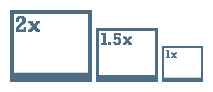
Retina screens are typically expressed with a DPR of 2; some Android screens might display different values, some as low as .75. On an iPhone that has a DPR of 2, a 320 CSS pixel width container will display 640px of physical image data.
The rule of thumb is to develop graphics that are twice as large as they would be represented on a standard screen and then scale down. You want to avoid up–scaling graphics that are not strictly vector, because then you are relying on the computer to invent pixels and “guess” at the details. This is called interpolation and is generally a bad practice that results in sloppy or blurry-looking graphics.
Here is a visual example of a graphic that lives on the Imgix homepage, its CSS dimensions, and its physical dimensions:

Setting Up Photoshop
Designer workflows are in constant flux, and some designers may bypass a Photoshop layout entirely. However, assets that are photographic or raster–vector hybrids still need to be made in an application like Photoshop, and an understanding of the relationship between a layout and the graphics needs to be maintained.
Document Setup
With a Photoshop layout, whether or not you are designing on a Retina screen, it is still best to articulate the layout in terms of CSS pixels to work best with a developer. Many of the tools in Photoshop are nondestructive or vector, such as shapes and layer styles. Because of this, most of the time it is OK to represent them at a standard (non-Retina) size, because it will help dictate design intent and translate the design to development.
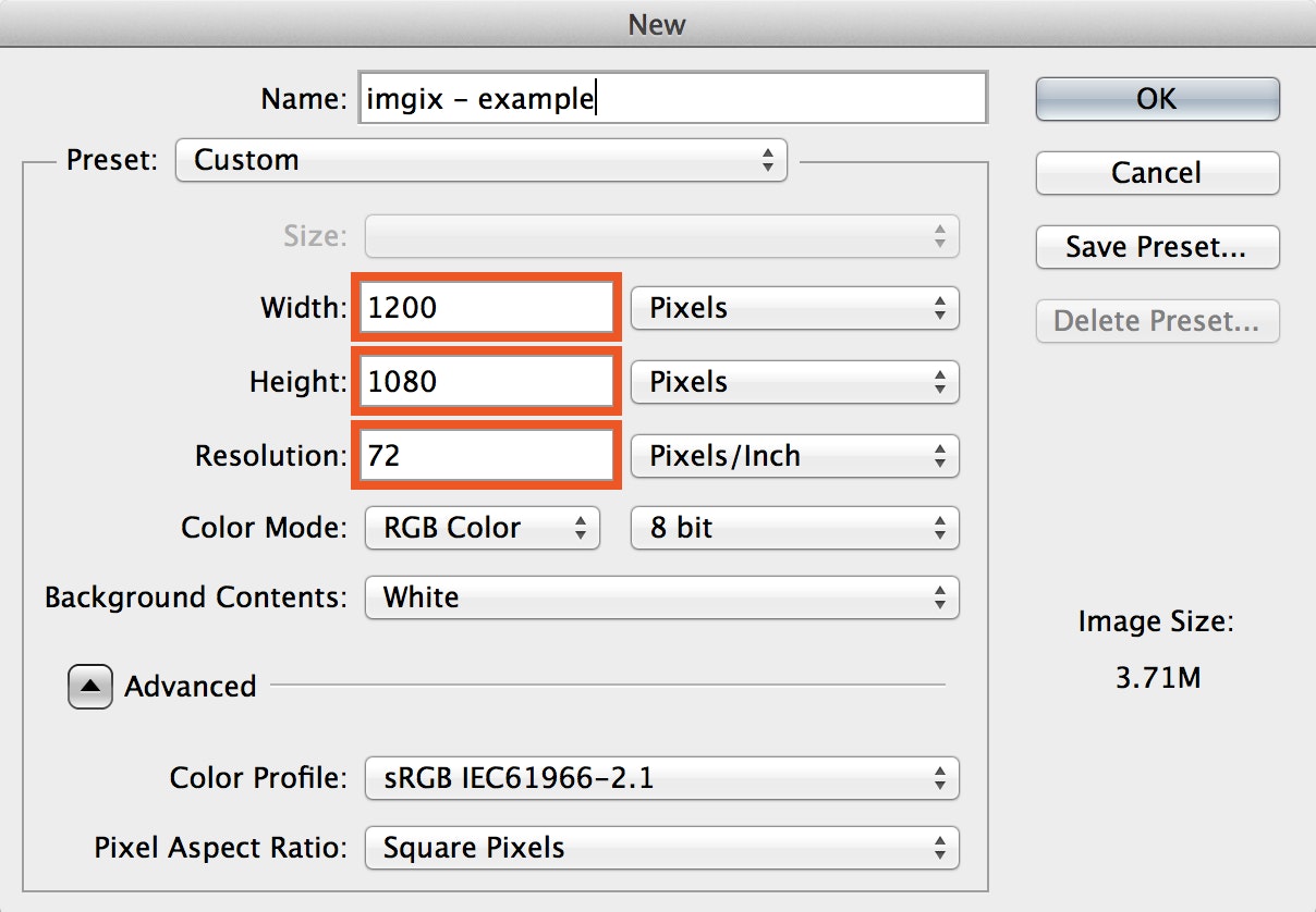
When you begin, create documents at 72dpi. A screen is a screen, a pixel is a pixel; giving a document a DPI value of 144 does not make it magically Retina.
It is always best to begin your design layout at a base breakpoint—your design needs to start somewhere. For this example, we will make a new Photoshop document at 1200 x 1080px to begin with a 960px centered breakpoint design.
Guides & Grid
Always work with a grid and snap to it when wireframing. When transforming elements, it’s best to transform from the top left orientation of a graphic and scale to whole pixels.
For this example, we’ll be working with a grid of 10px and 2 subdivisions. This gives me 5px square boxes. This may vary depending on your project and breakpoints; this is a generalized example.

- Adjust Grid Settings: Photoshop > Preferences > Guides, Grid & Slices
- Adjust Snapping: View > Snap (selected), View > Snap To > Grid (deselect others that may cause conflict)
Select & Transform
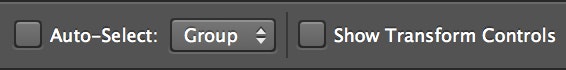
We recommend against using the “Auto-Select” and “Show Transform Controls” options. They can cause accidental input and modification of your layouts and can potentially disrupt your design intent.
Instead, you can use a right-click (Ctrl-click) for canvas selection of specific layers, and the Command + T short-key to bring up transform controls on objects selectively.

Wireframe & Graphic Area
Begin with wireframing your layout as pixel values; this will help you better understand the target destination for your graphics and their placement. Create rectangle shape objects, and align to the grid using the Transform tool (Command + T) to manipulate and place your wireframe objects.
The idea here is to define your destination “graphic areas.” You dont have to perfect your entire design, just enough to give context for the graphics you’re making.

Once again, move and scale these shape objects according to the top left origin point. Use the transform coordinates to get more precise placement of your objects. You can right-click in the transform panel to change your values between percentages and pixels.
Remember that all of this wireframing is done as a 1x layout. This layout provides a good understanding of how CSS will interpret pixel values as device independent pixels.
To create our Retina graphics we will be converting these shape objects to Smart Objects that will contain our 2x assets. In our original layout, they will then be scaled down by half to be viewed as 1x.
Smart Object Workflow
Smart Objects retain original scaling and rotation properties and also make “slicing” or asset farming simple. You can have a Smart Object that contains your graphics at Retina size, scaled 50% in a 1x layout for in–context viewing. A Smart Object basically acts like a Photoshop document within a Photoshop document.

Step 1: Create a Smart Object from one of your graphic areas in the layout
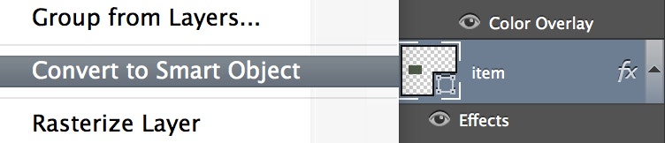
To do this, go to that shape layer in the Layer menu, select the object layer and do two things: Rasterize and then Convert to a Smart Object.
Because of some buggy behavior in Photoshop, it is best to Rasterize your wireframe layer before converting it to a Smart Object. Photoshop has a habit of adding 1px to the dimensions, which can affect how it scales. Check to see that the layer matches the correct size using the Transform Panel (Command + T).
- Control + Click on the layer to choose Rasterize option.
- Control + Click on the layer to choose Convert to Smart Object option.
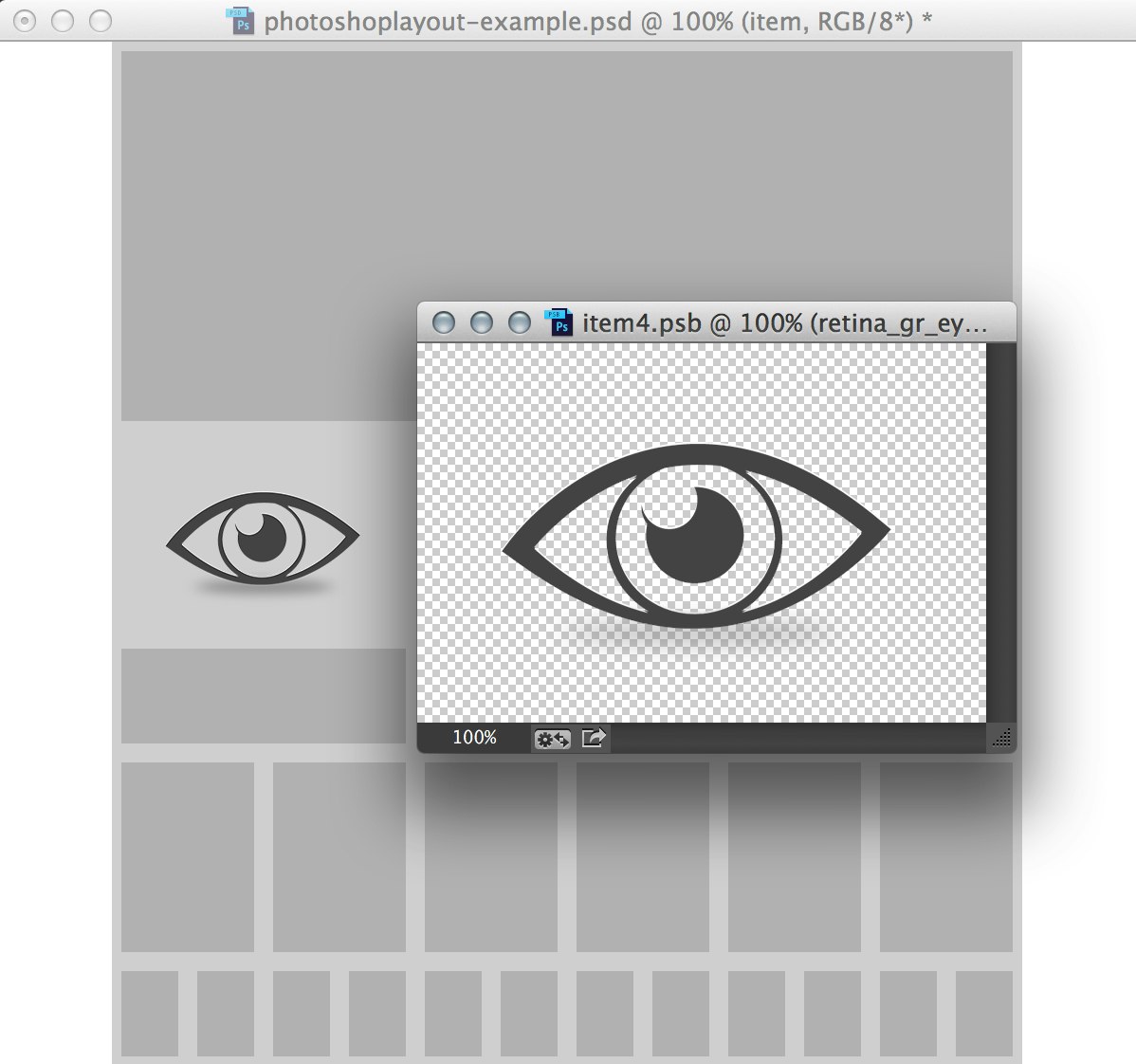
Step 2: Open the Smart Object
In the Layers panel, double click on the Smart Object icon for the layer you just converted. This will bring up the Smart Object in another window. Save the newly opened document to see the changes reflected in your original layout.

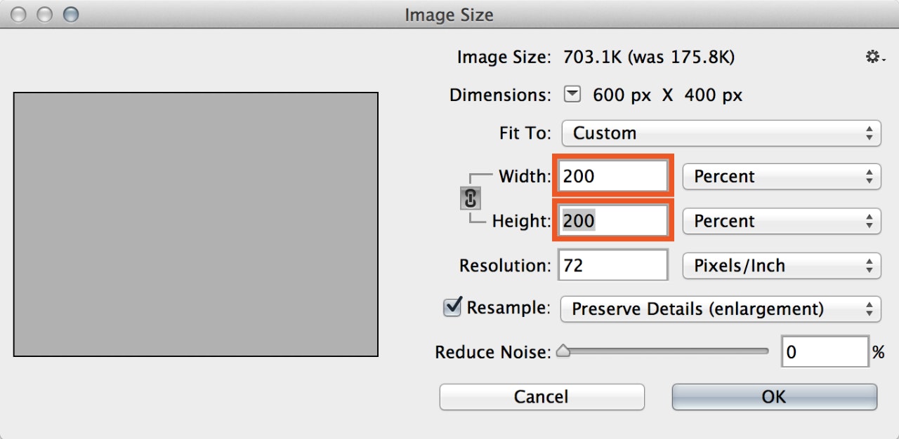
Step 3: Double the Smart Object Size
Open the Image Size panel: Image > Image Size (Command + Option + i). Change the height and width by 200%. Don’t worry about interpolation from upscaling—you are only interested in the pixel area, not the wireframe object. Notice the pixel dimensions are now doubled.
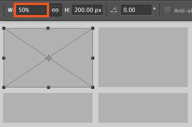
Step 4: Scale & Position the Smart Object 50%
Use the transform panel and a top left origin point to move and scale your graphic back down to match its original position. A 300x200px square will have the place of a 600x400px Smart Object. The Smart Object will retain this 50% status if you use the Transform tool to adjust it later. Double click the Smart Object icon in the Layers panel for that layer at any point that you need to edit its contents.
Note: All solid 1px edges and lines should be 2px wide and all pixel defined strokes and values should be whole, landing on even pixel values for pixel crisp downsampling.
Step 5: Create Your Graphics, Work in Layout
While working in the Smart Object Document, when you save, you will see all of the changes reflected in the 1x layout.
Step 6: Export your graphic from the Smart Object Instance
Because the Smart Object is essentially its own document referenced within your layout, you can use the Save For Web dialogue while it’s open, which bypasses the need to “slice” the image. My recommendation is to save your art “lossless-y” as a PNG 24; later you can use Imgix to render to a more compressed JPEG or a physically smaller graphic as necessary.
Note: If you need a 50% scaled version and are using the many-file method approach to Retina graphic handling, you can export a 50% image with the Save For Web dialogue in addition to your larger one.
Imgix Scaling & DPR
Once you place your Retina–sized image in the web source directory configured with Imgix you can begin to serve it out at many different device-appropriate sizes using the DPR parameter and value. You must specify both a size URL string parameter (primarily width, w) along with a DPR value to receive an image that is appropriately scaled.
Example 1
Here is an image targeting a 280px width area with a DPR of 2. This would display well on a Retina device. Notice that the width of the image is expressed in CSS pixels. So at 280 CSS pixels with a DPR of 2, the resulting physical width of the image is 560px.
w=280&fm=png&dpr=2
width: w=280
format: fm=png
device pixel ratio: dpr=2
feature-face-detection.png?w=280&fm=png&dpr=2
Example 2
Here is the same image, same CSS pixel width of 280, now with a DPR value set to 1. The physical pixel size of the rendered image is 280px.
w=280&fm=png&dpr=1
width: w=80
format: fm=png
device pixel ratio: dpr=1
feature-face-detection.png?w=280&fm=png&dpr=1
Example 3
If you need to further compress the Retina image for mobile devices, you can then decide if you want the transparent PNG as a compressed JPEG flattened with a grey background.
w=280&fm=jpg&dpr=2&q=40&bg=777
width: w=280
format: fm=jpg
device pixel ratio: dpr=2
quality: q=40
background color: bg=777
feature-face-detection.png?w=280&fm=jpg&dpr=2&q=40&bg=777